

Alignment. Strength. Mobility. Flow.
Before KunAqua, there was an aircraft.
I’ve worked at scale—designing an airline livery that crossed continents, selected ahead of global agencies such as Landor and Saatchi & Saatchi.
It was over twenty-five years ago, for BWIA West Indies.
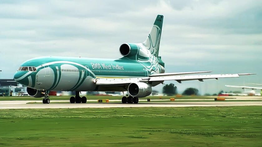
At the time, wrapping an aircraft in a continuous graphic was rare—especially for a national carrier. Most liveries were restrained, linear, careful. I wanted something else.
The inspiration came from the steel drum—the instrument born in the Caribbean. I took a section of the drum and placed it on the tail, then allowed its form to travel forward, wrapping the fuselage. By the time it reached the nose of the aircraft, the lines created something unexpected.
A smile.
At the time, I assumed most people wouldn’t recognise what a steel drum was.
They do now.
I remember being told a story by the pilot who flew the first aircraft with the new design into Heathrow. As he approached, air traffic control came over the radio—not with instruction, but with a comment:
“That aircraft looks amazing.”
That stayed with me.
Because it meant the design had done its job. It communicated instantly—without explanation.
But the KunAqua symbol is different.
Smaller—but in many ways, more important.
Because this wasn’t about identity.
It was about understanding something I had seen repeatedly over decades of working with the body—and expressing it simply.
For years, I worked in environments where people were doing everything right.
They trained consistently. Followed programmes. Built strength. Improved flexibility. Stayed active.
And yet, something didn’t add up.
The body could appear strong while quietly compensating. Movement looked controlled, but effort wasn’t evenly distributed. One side would take over. Momentum would carry the rest.
It worked—until it didn’t.
The signs didn’t show immediately. They built slowly.
Tightness. Discomfort. Instability.
Not failure.
Drift.
Water changed that.
Not as recovery, and not as something softer—but as a different set of conditions entirely.
In water, momentum disappears quickly. Resistance comes from every direction. You can’t rush movement or hide behind speed.
If one side contributes less, you feel it immediately.
The body has to organise itself.
And over time, everything came back to three things:
Alignment.
Strength.
Mobility.
Not in isolation—but working together.
When alignment is right, the structure holds.
When strength supports it, movement stabilises.
When mobility allows it, movement continues.
And when those three come together properly, something else appears.
Flow.
The symbol came from that realisation.
Not as a design exercise—but as a way to capture what I had seen in practice.
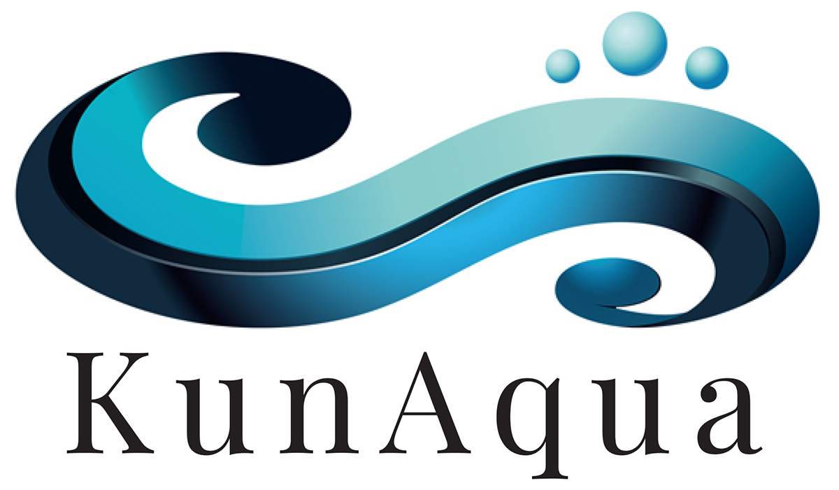
The wave represents water—not as a backdrop, but as the teacher. The environment that exposes what’s really happening.
The three air bubbles above it represent what the body must organise:
Alignment.
Strength.
Mobility.
Flow is not something you add.
It’s what happens when those elements are in place.
In design, simplicity is rarely simple.
With the aircraft, the challenge was how to express identity at scale.
With KunAqua, the challenge was the opposite.
How to express something essential—without adding anything unnecessary.
No decoration. No excess explanation. Just the structure.
Because the symbol doesn’t teach you anything.
The water does that.
The symbol just reminds you.
Over time, I’ve come to see that this is not just about movement.
It’s about how the body sustains itself.
Not through intensity.
Not through repetition.
But through organisation.
Balanced movement lasts.
And that is what KunAqua is built on.
The symbol doesn’t explain that.
It can’t.
It simply reflects it.
A wave.
Three elements.
And what happens when they come together.
Flow.

